Choosing the Right Font and Size for Better SEO: Practical Tips from SiteGuru
Typography is key to a good website. It drastically impacts user experience and your overall SEO strategy. SiteGuru understands the importance of fonts and sizes. This article gives you practical tips. You will learn how to choose the best fonts. You will also learn how to pick the right sizes. This will improve your website’s SEO and user engagement.
The SEO Impact of Fonts, Sizes, and Readability
SEO Academy teaches many things. Font sizes have a direct impact on readability. Readability influences user experience. Poor typography choices increase bounce rate. People leave your site quickly. Search engines like Google notice this behavior. Good typography choices keep visitors on your page. They spend more time reading your content. This longer dwell time signals to Google that your content is valuable.
Readability is Paramount: Easy-to-read text keeps people engaged and reduces eye strain.
User Experience Matters: A positive user experience translates to longer site visits.
Mobile SEO is Crucial: Ensure your fonts look great on mobile devices. Google now uses a mobile-first index.
Accessibility Considerations: Help users with visual impairments read your content easily.
Enhanced User Engagement: Good typography encourages clicks, shares, and comments.
Dwell Time Increase: Readable content increases the amount of time users spend on your pages.
Fonts do more than just look good. They directly affect how people interact with your site. SiteGuru knows that a user friendly website leads to better SEO. Font choices impact your brand identity. Choosing readable fonts is essential.
Selecting the Right Fonts: A Practical Guide
Choosing fonts impacts your website’s branding. It also directly affects readability. Here are some practical tips:
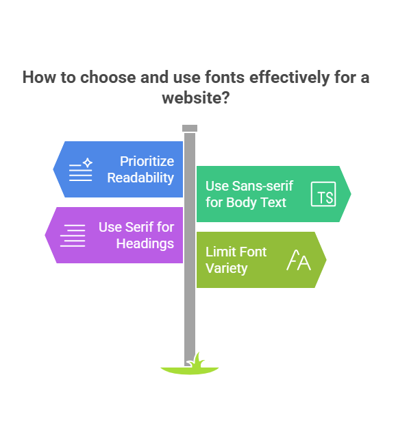
Prioritize Readability Above All: Use clear, simple fonts designed for screen reading.
Sans-serif Fonts for Body Text: Arial, Helvetica, Open Sans, Roboto, and Lato are excellent choices.
Serif Fonts for Headings (Use Sparingly): Georgia, Times New Roman, and Merriweather work well.
Limit Font Variety: Stick to two or three fonts maximum for a cohesive design.
Consider Your Branding: Pick fonts that align with your brand identity and target audience.
Ensure Legibility: Avoid overly stylized or decorative fonts for large blocks of text.
Test Font Pairings: Choose fonts that complement each other visually.
Here is a table of commonly used fonts for websites.
Font Name
Type
Usage Recommendation
Characteristics
Open Sans
Sans-serif
Body text, headings
Clean, modern, highly readable
Georgia
Serif
Body text, works well on screens
Classic, elegant, good for longer articles
Roboto
Sans-serif
Body text, mobile-friendly
Geometric, versatile, optimized for Android
Montserrat
Sans-serif
Headings, modern look
Bold, impactful, suitable for headlines
Merriweather
Serif
Body text, elegant and readable
Strong serifs, designed for comfortable reading
Lato
Sans-serif
Body Text, Clean & Modern
Rounded details create warmth and readability
This table summarizes common fonts. Choose fonts that improve readability. Consider your target audience and website design.
Mastering Font Sizes for Optimal Readability and SEO
Font sizes play a crucial role in readability. Select sizes that are easy on the eyes across all devices. Here are some specific tips:
Body Text Size: Use at least 16px. 18px or even 20px might be better.
Heading Hierarchy: Use a clear size hierarchy for headings (H1, H2, H3, etc.). H1 should be the largest, followed by H2, and so on. Google also uses this to understand the content.
Mobile Optimization: Test font sizes on various phones and tablets.
Line Height Adjustment: Set a line height of 1.5 to 1.7 for improved readability.
Contrast Considerations: Ensure good contrast between text color and background color. Use contrast checker tools to ensure accessibility.
SiteGuru Tip: Google’s Material Design style guide suggests 16px as a baseline. This is a good starting point for body text. Adjust based on your specific font and user testing. Using their guidelines makes your site more user friendly.
Consider this table of suggested font sizes.
Element
Suggested Size
Notes
Responsive Considerations
Body Text
16px – 20px
Adjust based on font and user testing
Use relative units (em or rem)
H1
24px – 32px
Largest heading, most important
Scale down on smaller screens
H2
20px – 24px
Subheadings, secondary importance
Adjust for mobile readability
H3
18px – 20px
Section titles, supporting content
Maintain a clear visual hierarchy
Paragraph
16px – 18px
Standard text block
Ensure proper spacing on mobile devices
This table gives a basic guide. Always test your font sizes. Check readability on different devices.
Units, Style Sheets, and Website Optimization
Pixels (px) are a common unit. Relative units like em and rem are generally better for responsive design. These units automatically adjust to different screen sizes. This is crucial for mobile-first indexing.
Pixels (px): Absolute size. Use them for specific elements.
Ems (em): Relative to the parent element’s font size. Changes with inheritance.
Rems (rem): Relative to the root HTML element’s font size. More consistent across your website.
SiteGuru Tip: Use Google Pagespeed Insights to assess your website’s performance. Optimize images and leverage browser caching. Fast loading sites are preferred. Crawling and indexing is more efficient.
Adjust your style sheet (stylesheet) as needed. A simple tweak to your CSS file helps improve your SEO. Use a well written paragraph to improve user experience.
Remember to think about marketing and promotion. Great typography enhances content marketing. It makes your website look professional and trustworthy. A good digital marketing strategy is key. The best SEO specialist knows this.
Good link building also helps SEO. Using the right anchor texts also help you to get more visibility. Link building is essential to improve seo of your website.
FAQ’s
What size font is most professional?
16px to 18px is generally ideal for body text. Headings should be proportionally larger.
What is the best font size for a responsive website?
Use relative units like rem or em for body text. This will ensure the font size scales properly on all devices.
What is the most attractive font for a website?
This choice depends on your branding. Popular options include Open Sans, Montserrat, and Georgia.
What is the best font size for website readability?
16px to 20px is a good starting point for body text. Ensure sufficient contrast and proper line height.
What is dynamic font size?
It refers to fonts that automatically adjust based on the device screen size or user preferences.
What font does the US government use?
The US government employs various fonts. Times New Roman and Arial are frequently used.
What font does the CIA use?
This information is not publicly accessible. Operational security is important to them.


